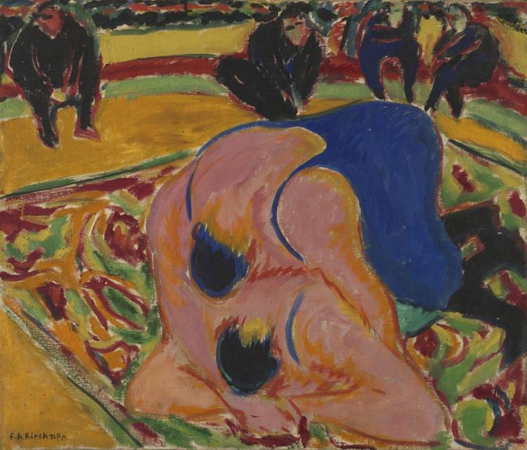
Life and career
Kirchner helped found Die Brücke in Dresden in 1905 and later worked in Berlin, where modern street encounters became major subjects. The disruption of World War I and later life in Switzerland changed his circumstances. Prints remained central to his experiments; Nazi persecution subsequently threatened his work and public standing.
Works across a career
Selected examples, not a complete catalogue. Read date ranges and attributions before inferring a career sequence.
- 01
1908
1908
The Sea near Staberhuk
- Material / technique
- lithograph
- Attribution / role
- Museum attribution
- Collection / source
- The Cleveland Museum of Art
Museum catalogue note
Ernst Ludwig Kirchner made this print during the first year that he learned the lithographic process. In contrast to convention, he wished to make it immediately apparent that a lithograph was not a drawing. To do so, he used lithographic wash to draw right to the edges of the stone, abruptly cutting off the composition and emphasizing the stone’s irregular contour with inked edges. The spontaneity of the quickly drawn marks that mimic the weather and wind of the sea, coupled with the emphasis on the materiality of the stone, matched Kirchner’s quest for truth in his art.
Collection text · The Cleveland Museum of Art · CC0 - 02
c. 1914
c. 1914
On the Street
- Material / technique
- etching and aquatint
- Attribution / role
- Museum attribution
- Collection / source
- The Cleveland Museum of Art
- 03
1924
1924
Wehrlin, Facing front
- Material / technique
- woodcut
- Attribution / role
- Museum attribution
- Collection / source
- The Cleveland Museum of Art
Compare materials, style and colour
The 1908 sea lithograph, the street image around 1914 and the 1924 portrait use different print processes and kinds of compression. Compare broken tonal texture with cut relief edges, and how figures or landscape become angular rhythms. Monochrome can be as forcefully expressive as the bright colours of his paintings.
Material
What can this material do? Distinguish a design, an original object and a later impression or cast.
Style
Compare viewpoint, edges, composition and marks. Which choices persist, and which change?
Colour
Compare palette, contrast and light. Consider the support, printing, surface treatment and ageing.
Sources and further reading
Original educational interpretation; catalogue descriptions are separately credited. Each study links to its source. Reference entries without images are not added to the comparison timeline.